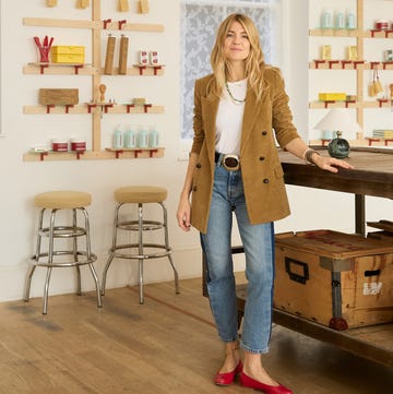
A flair for home decoration is in Tash Bradley’s genes. “My mum was an interior designer, so when I was growing up, we’d move house a lot and she’d renovate every property from scratch,” she recalls. “So from a very young age, I saw what the process was like, and I think I have that understanding in my DNA. Home has always been my happy place.” Although she studied fine art and initially planned to become a professional artist, she found it too lonely a lifestyle (“I’m a people person”); an interior-design course at University of Arts London offered the perfect opportunity for a career pivot. “There was a module on colour theory, and that was my lightbulb moment,” explains Bradley. “No one else in the design world was really championing colour and the power it has in our homes – I decided then and there to make that my craft.”
At around that time, Bradley’s husband Sam was in the process of refining the concept for Lick, a new paint brand he was co-founding with Lucas London. She created a niche for herself as the brand’s director of interior design and head colour specialist, using her expertise to create Lick’s distinctive colour palette. The company offers a maximum of 100 shades at any one time, with Bradley’s goal being to save her clients from “colour paralysis” – the name she gives to the state consumers can easily enter when they are faced with the tyranny of choice. “So many people think they really want to try using colour, and then they panic and default to the beige sofa!” she says, smiling. “My role is to educate them and give them confidence.”
Bradley has since given more than 5,000 one-to-one consultations and has recently published a book, Master the Art of Colour, in which she aims to share the lessons she has learnt with an even wider audience. Here are her top seven tips for how to use colour in your home…
1/ Try colour-drenching
"When you use a single paint shade on a wide range of surfaces, it can really help open up a room, because you’re not drawing attention to the outline of the woodwork or showing where all the doors are."
2/ Experiment with contrasts
"You can use colour to your advantage in a small space: for instance, when my husband and I owned a tiny studio in Clapham, we painted the hallway a very dark tone so that the eye would be led towards the main space, which was pale pink, and felt really bright and open as a result."
3/ Lighter isn’t always brighter
"Be aware that light colours are highly reflective, so they show up a lot of shadow. If you’re choosing a pale shade, opt for a rich, pigmented neutral so that it can absorb some of the light."
4/ If you’re nervous about using colour, start small
"Painted skirting boards can look really pretty, as can bedside tables, especially if you pick a shade that will look lovely in the warm glow of lamplight. Even having a colourful headboard on the bed is a great place to begin."
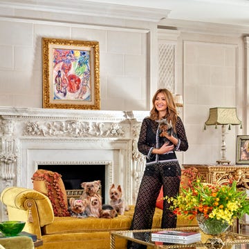
5/ Art is the ideal way to introduce vibrancy
"If you’ve chosen an artwork you love, you’ll connect with it and so you’ll be comfortable with the colour it brings."
6/ Remember to look down as well as up
"People tend to forget about the floor, but it really changes how a room feels. Consider adding a colourful rug – the bigger, the better."
7/ Break the rules
"They say pink and green should never be seen, but I think it’s a wonderful combination. In the end, colour is a language everyone speaks, and you just have to find the courage to choose the one you love."
‘Master the Art of Colour’ by Tash Bradley is out now.


